As we shared back in June, we’ve been updating our league’s branding and identity with an eye on our future. We’re athletic, inclusive and enthusiastic to represent roller derby in Calgary and beyond.
Today, we’re delighted to share two more logos in our arsenal.
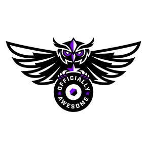
For the first time, our referees and NSOs will be represented by their own glorious logo! Team Officially Awesome shared their ideas for their logo with our designer Tracy Niven, who took it to the finish line with gusto. The owl represents grace and wisdom (and maybe a bit of ferocity that all raptors are known for), and clutches the team name designed into a skate wheel.

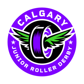
And Calgary Junior Roller Derby has a fully new logo, too. CJRD’s new logo needed to carry a lot of weight: it needed to mesh with our existing CRD logo, while signalling that it represented junior skaters. Representing junior skaters means doing so for all our young skaters, from six to 17 years old. It’s a lot to ask, and Tracy really came through for us. The final design builds on our new house team logos in structure. The winged wheel is a spin on symbolism: the wings may stand for victory, for speed, or for our skaters being under the wings of their coaches as they learn and thrive.

Before

After
Is your league looking at a logo update or rebranding exercise? Have questions? Shoot us a note at media@calgaryrollerderby.com, we’re happy to chat!


